11 解释性图表
11.1 引言
通过前一章节我们知道如何分析数据,接下来就需要将自己的理解传达给他人。由于我们的受众可能不具备相关背景知识,所以要确保图表尽可能一目了然,从而帮助他们快速建立对数据的准确认知。
简言之,目标是:将探索性图表转化为解释性图表。
必要工具包:
library(tidyverse)    # 含ggplot2
library(scales)       # 调整坐标轴刻度/标签
library(ggrepel)      # 智能标签防重叠
library(patchwork)    # 多图排版
11.2 标签(Labels)
使用labs()为图表添加标签,增强图形可读性:
ggplot(mpg, aes(x = displ, y = hwy)) +
  geom_point(aes(color = class)) +
  geom_smooth(se = FALSE) +
  labs(
    x = "Engine displacement (L)",
    y = "Highway fuel economy (mpg)",
    color = "Car type",
    title = "Fuel efficiency generally decreases with engine size",
    subtitle = "Two seaters (sports cars) are an exception because of their light weight",
    caption = "Data from fueleconomy.gov"
  )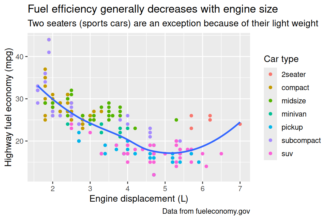
图表标题的作用是概括核心内容。注意标题不能仅描述图表类型(如“发动机排量与燃油经济性的散点图”)。
除了主标题,还有两种标签:
subtitle:在主标题下方以较小字体添加补充说明caption:在图表右下角添加文字(通常用于注明数据来源)
通过labs()函数也可以修改坐标轴和图例标题。建议将简短的变量名替换为更详细的描述,并包含单位信息。
此外,还可以使用数学公式代替普通文本标签。只需将引号替换为quote(),具体语法可参考?plotmath。
df <- tibble(
  x = 1:10,
  y = cumsum(x^2)
)

ggplot(df, aes(x, y)) +
  geom_point() +
  labs(
    x = quote(x[i]),
    y = quote(sum(x[i]^2, i==1, n))
  )
11.3 注释(Annotations)
除了标签外,对个别观测值或观测值组进行注释也很有用。基础函数是geom_text(),它与geom_point()类似,但多了一个label美学属性,可以在图表中添加文字注释。
注释有两种方法。
第一种是使用专门准备的标注数据框。例如,我们提取每种驱动类型中发动机排量最大的车型信息:
label_info <- mpg |>
  group_by(drv) |>
  arrange(desc(displ)) |>
  slice_head(n = 1) |>
  mutate(
    drive_type = case_when(
      drv == "f" ~ "front-wheel drive",
      drv == "r" ~ "rear-wheel drive",
      drv == "4" ~ "4-wheel drive"
    )
  ) |>
  select(displ, hwy, drv, drive_type)

label_info
#> # A tibble: 3 × 4
#> # Groups:   drv [3]
#>   displ   hwy drv   drive_type
#>   <dbl> <int> <chr> <chr>
#> 1   6.5    17 4     4-wheel drive
#> 2   5.3    25 f     front-wheel drive
#> 3 7 24 r rear-wheel drive然后直接在图表上标注这三组数据,用注释代替图例。通过调整字体大小(size)和粗细(fontface)可以突出注释:
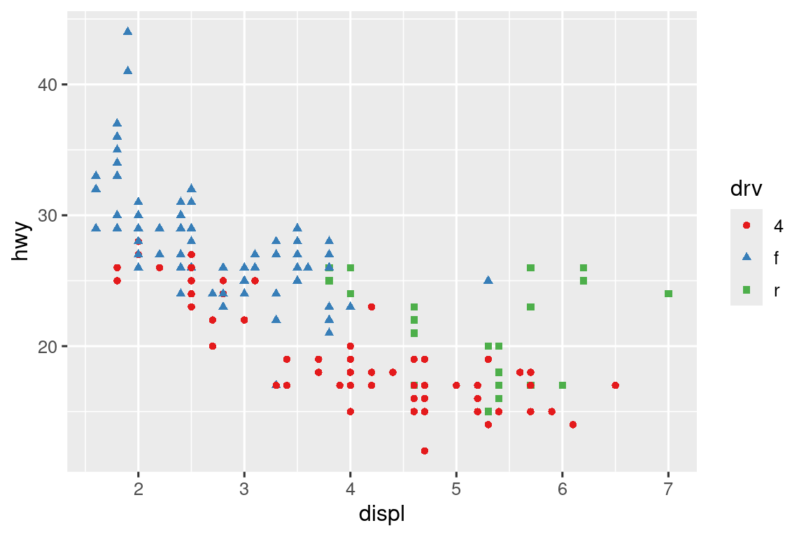
ggplot(mpg, aes(x = displ, y = hwy, color = drv)) +
  geom_point(alpha = 0.3) +
  geom_smooth(se = FALSE) +
  geom_text(
    data = label_info,
    aes(label = drive_type),
    fontface = "bold", size = 5, hjust = "right", vjust = "bottom" # 控制标注对齐
  ) +
  theme(legend.position = "none")  # 隐藏图例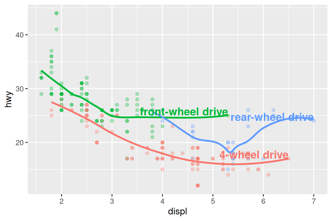
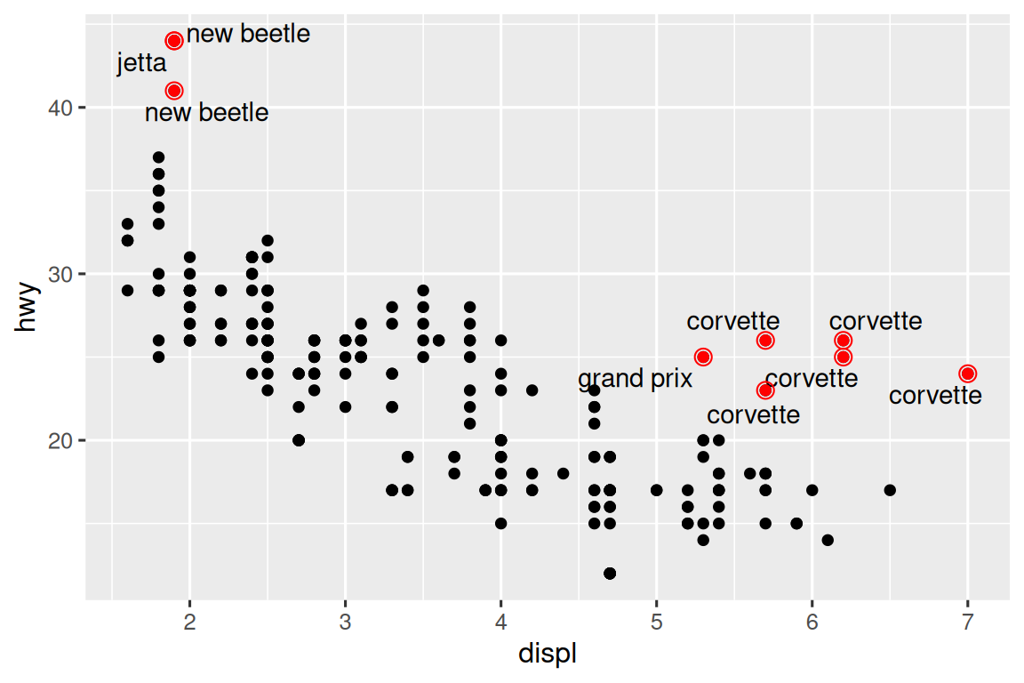
注意到注释与散点重叠,此时可以使用ggrepel包的geom_label_repel()自动调整位置:
ggplot(mpg, aes(x = displ, y = hwy, color = drv)) +
  geom_point(alpha = 0.3) +
  geom_smooth(se = FALSE) +
  geom_label_repel(
    data = label_info,
    aes(label = drive_type),
    fontface = "bold", size = 5,
    nudge_y = 2  # 垂直偏移
  ) +
  theme(legend.position = "none")
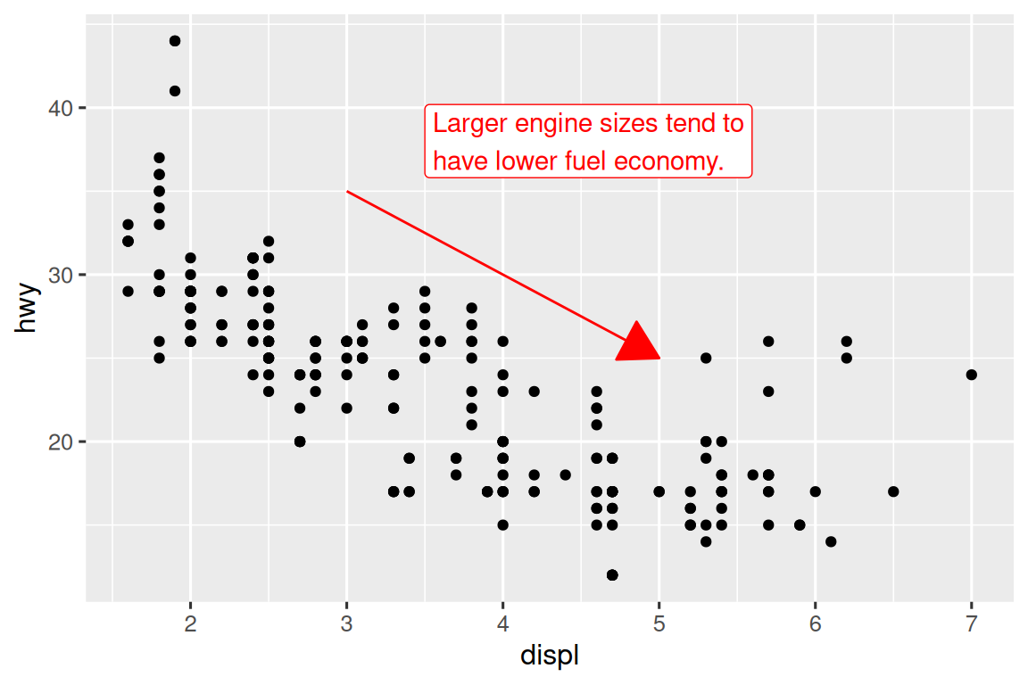
结合geom_text_repel()和特殊标记则可以突出异常点:
potential_outliers <- mpg |> filter(hwy > 40 | (hwy > 20 & displ > 5))

ggplot(mpg, aes(x = displ, y = hwy)) +
  geom_point() +
  geom_text_repel(data = potential_outliers, aes(label = model)) +
  geom_point(
    data = potential_outliers,
    color = "red", size = 3, shape = "circle open"  # 空心红圈标记
  )
其他标注特殊点的方法:
- 参考线:使用
geom_hline()/geom_vline() - 矩形标记:使用
geom_rect()或ggforce::geom_mark_hull() - 箭头指示:使用
geom_segment(arrow = arrow())
注释的第二种方法是使用annotate函数。
annotate()适合添加少量独立标注元素。例如添加趋势说明:
trend_text <- "Larger engine sizes tend to have lower fuel economy." |>
  str_wrap(width = 30)
trend_text
#> [1] "Larger engine sizes tend to\nhave lower fuel economy."
ggplot(mpg, aes(x = displ, y = hwy)) +
  geom_point() +
  annotate(
    geom = "label", x = 3.5, y = 38,
    label = trend_text,
    hjust = "left", color = "red"
  ) +
  annotate(
    geom = "segment",
    x = 3, y = 35, xend = 5, yend = 25, color = "red", # 给箭头定位
    arrow = arrow(type = "closed")
  )
11.4 比例尺(Scales)
比例尺也可调整美学映射的视觉表现形式。
11.4.1 默认比例
ggplot2 默认添加的比例尺如下:
ggplot(mpg, aes(x = displ, y = hwy)) +
  geom_point(aes(color = class)) +
  scale_x_continuous() +
  scale_y_continuous() +
scale_color_discrete()命名规则:scale_ + 美学名称(如 x、color) + _ + 比例尺类型(如 continuous、discrete)。
continuous表示将数值以连续刻度形式映射。discrete表示基于每个离散变量类别进行分配。
默认比例尺适用于大多数情况。
11.4.2 轴刻度和图例键
坐标轴和图例统称为引导元素(guides)。其中坐标轴用于呈现x和y美学映射,而图例则负责展示其他所有美学映射。
影响坐标轴刻度线和图例显示的两个主要参数是: breaks 和 labels。breaks参数用于控制刻度线的位置或与图例相关联的数值;labels参数则控制每个刻度线或图例对应的文本标签。
以下分别为例:
# break修改y轴刻度间隔
ggplot(mpg, aes(x = displ, y = hwy)) +
  geom_point() +
  scale_y_continuous(breaks = seq(15, 40, by = 5))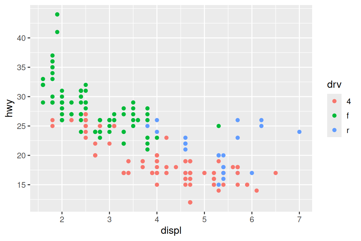
ggplot(mpg, aes(x = displ, y = hwy, color = drv)) +
  geom_point() +
  scale_x_continuous(labels = NULL) +
  scale_y_continuous(labels = NULL) +
  scale_color_discrete(labels = c("4" = "4-wheel", "f" = "front", "r" = "rear"))
labels参数与scales包中的标签格式化函数结合使用时,能有效实现数值的货币化(如添加美元符号)、百分比化等格式转换。比如label_dollar()函数效果如下,通过将美元数值除以1000并添加”K”,同时自定义刻度间隔点(breaks参数仍基于原始标度设置)。
library(scales)
ggplot(diamonds, aes(x = price, y = cut)) +
  geom_boxplot() +
  scale_x_continuous(labels = label_dollar(scale = 1/1000, suffix = "K"))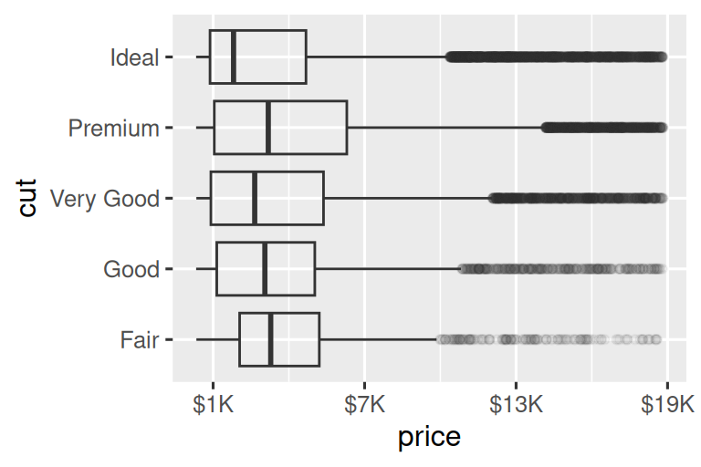
另一个实用的函数是 label_percent(),将标签改为百分比形式。
ggplot(diamonds, aes(x = cut, fill = clarity)) +
  geom_bar(position = "fill") +
  scale_y_continuous(name = "Percentage", labels = label_percent())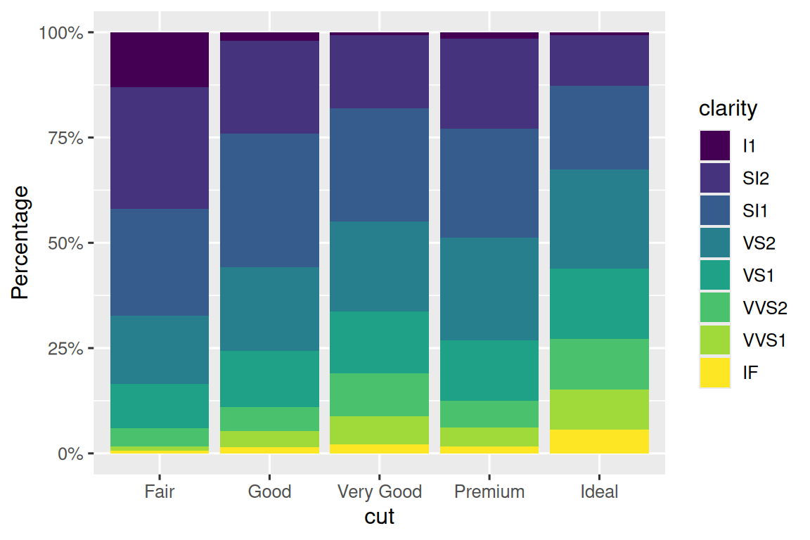
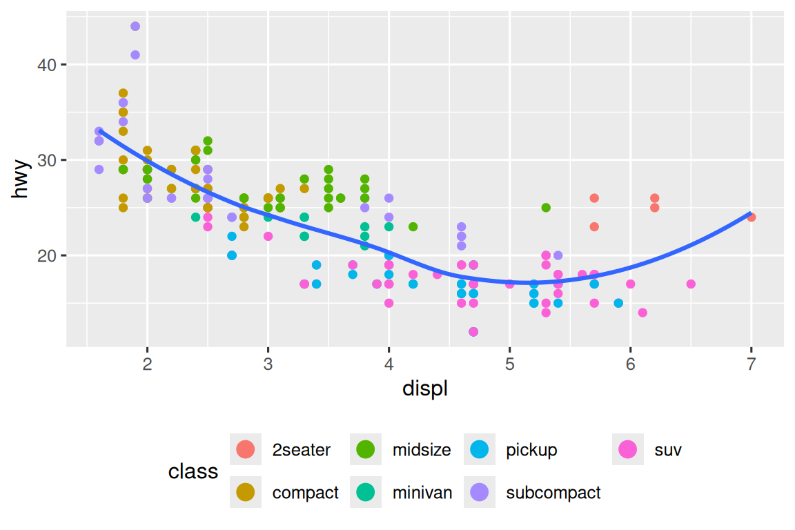
另外,breaks 参数还有另一个用途。当数据点较少时可精确标注观测值位置。以展示美国总统任期起止时间的图表为例:
presidential |>
  mutate(id = 33 + row_number()) |>
  ggplot(aes(x = start, y = id)) +
  geom_point() +
  geom_segment(aes(xend = end, yend = id)) +
  scale_x_date(name = NULL, breaks = presidential$start, date_labels = "'%y")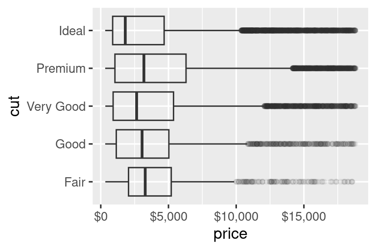
11.4.3 图例布局
breaks和labels参数最常用于调整坐标轴,虽然它们也可用于图例,但图例调整通常需要其他方法。
控制图例整体位置需使用theme()设置(在本章末尾详述,它主要用于控制图形的非数据元素)。通过theme()的legend.position参数可指定图例位置:
base <- ggplot(mpg, aes(x = displ, y = hwy)) +
  geom_point(aes(color = class))

# 默认右侧显示
base + theme(legend.position = "right")
# 左侧显示
base + theme(legend.position = "left")
# 顶部显示并控制图例分3行排列
base + theme(legend.position = "top") +
  guides(color = guide_legend(nrow = 3))
# 底部显示并控制图例分3行排列
base + theme(legend.position = "bottom") +
  guides(color = guide_legend(nrow = 3))
布局建议:
- 宽幅图形建议图例置于顶部或底部
- 窄幅图形建议图例置于左侧或右侧
- 使用
legend.position = "none"可完全隐藏图例
通过guides()配合guide_legend()或guide_colorbar()可控制单个图例显示。以下示例展示两个关键设置:
- 用
nrow更改图例行数 - 用
override.aes更改美学设置(如增大图例点大小)
ggplot(mpg, aes(x = displ, y = hwy)) +
  geom_point(aes(color = class), alpha = 0.5) +  # 半透明显示密集点
  geom_smooth(se = FALSE) +
  theme(legend.position = "bottom") +
  guides(color = guide_legend(
    nrow = 2,
    override.aes = list(size = 4)  # 图例点尺寸设为4倍
  ))
特别注意:
guides()中的参数名称必须与对应的美学映射名称完全匹配。
11.4.4 替换比例尺
除了微调参数外,还可以直接替换整个比例尺。最常需要替换的比例尺主要有两种:连续位置比例尺和颜色比例尺。
1. 连续位置比例尺
使用对数变换(保留原始刻度标签):
ggplot(diamonds, aes(x = carat, y = price)) +
  geom_point() +
  scale_x_log10() +
  scale_y_log10()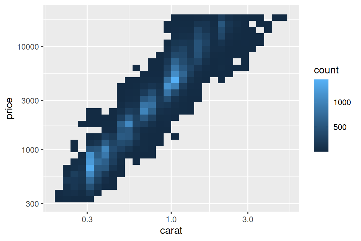
2. 颜色比例尺
离散型:使用 ColorBrewer 调色板(对色盲友好):
ggplot(mpg, aes(x = displ, y = hwy)) +
  geom_point(aes(color = drv)) +
  scale_color_brewer(palette = "Set1") # 适配红绿色盲
当需要自定义数值与颜色的映射关系时,应使用
scale_color_manual()。例如在总统政党数据可视化中,红色代表共和党,蓝色代表民主党,可以写成:scale_color_manual(values = c(Republican = "#E81B23", Democratic = "#00AEF3")连续型:使用内置的
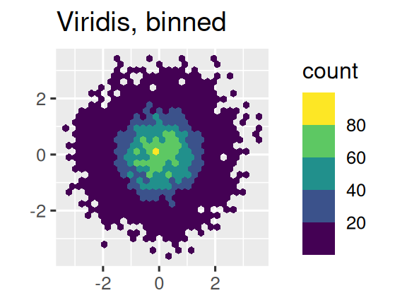
scale_color_gradient()或scale_fill_gradient()函数。如果需要发散的(diverging)颜色比例尺,则应当使用scale_color_gradient2(),该函数允许为正负值分配不同颜色(例如区分高于或低于均值的数据点)。另一个推荐方案是采用 viridis 色标体系。设计者 Nathaniel Smith 和 Stéfan van der Walt 精心打造的这些连续色标具有以下特性:
- 适配各类色盲患者的视觉需求
- 在彩色和黑白模式下均保持感知均匀性
- 在 ggplot2 中提供三种变体:
- 连续型(后缀
_c) - 离散型(后缀
_d) - 分箱型(后缀
_b)
- 连续型(后缀
应用示例如下:
df <- tibble(
  x = rnorm(10000),
  y = rnorm(10000)
)

ggplot(df, aes(x, y)) +
  geom_hex() +
  coord_fixed() +
  labs(title = "Default, continuous", x = NULL, y = NULL)

ggplot(df, aes(x, y)) +
  geom_hex() +
  coord_fixed() +
  scale_fill_viridis_b() +
  labs(title = "Viridis, binned", x = NULL, y = NULL)
11.4.5 缩放视图
控制图形显示范围主要有两个方法:
- 调整绘图数据范围
- 设置比例尺限制
比如当分别绘制SUV和小轿车的油耗数据时,两张图的坐标轴范围和图例显示不一致,SUV的x轴范围是4.0-6.5,轿车则是1.8-4.0;且图例也不同,SUV只有四驱和后驱,轿车只有前驱和四驱。两张图不能直接比较,需进行标度统一。
# 创建共享比例尺
x_scale <- scale_x_continuous(limits = range(mpg$displ))
y_scale <- scale_y_continuous(limits = range(mpg$hwy))
col_scale <- scale_color_discrete(limits = unique(mpg$drv))

# 应用至分面图形
ggplot(suv, aes(displ, hwy, color = drv)) +
  geom_point() +
  x_scale + y_scale + col_scale

ggplot(compact, aes(displ, hwy, color = drv)) +
  geom_point() +
  x_scale + y_scale + col_scale
11.5 主题(Themes)
主题(theme)用于自定义图表的非数据元素(如背景、网格线、字体等)。
ggplot2 提供8种内置主题,默认是 theme_gray()。常用主题包括:
| 主题函数 | 效果描述 |
|---|---|
theme_gray() |
灰色背景(默认) |
theme_bw() |
白色背景 + 灰色网格线 |
theme_classic() |
经典风格(无网格线,仅坐标轴) |
theme_minimal() |
极简风格(无背景和边框) |
theme_void() |
完全空白(仅显示几何对象) |
通过 theme() 函数可以精细控制图表外观,例如:
- 调整图例
ggplot(mpg, aes(x = displ, y = hwy, color = drv)) +
  geom_point() +
  theme(
    legend.position = c(0.6, 0.7),  # 图例位置(坐标范围0~1)
    legend.direction = "horizontal", # 图例水平排列
    legend.box.background = element_rect(color = "black")  # 图例边框
)- 坐标轴和网格线
theme(
  axis.text.x = element_text(angle = 45, hjust = 1),  # X轴标签旋转45度
  panel.grid.major = element_line(color = "gray80"),  # 主网格线颜色
  panel.background = element_rect(fill = "white")     # 绘图区背景色
要快速预览当前主题效果可用如下函数:
ggplot2::theme_get()11.6 多图布局(Layout)
当需要将多个图表组合成一个图形时,可以使用 patchwork 包。
- 让两个子图合并,并排显示
library(patchwork)
library(ggplot2)

# 创建两个图表对象
p1 <- ggplot(mpg, aes(x = displ, y = hwy)) +
  geom_point() +
  labs(title = "散点图:发动机排量 vs. 油耗")

p2 <- ggplot(mpg, aes(x = drv, y = hwy)) +
  geom_boxplot() +
  labs(title = "箱线图:驱动类型 vs. 油耗")

# 并排显示
p1 + p2- 复杂布局(
|和/)
p3 <- ggplot(mpg, aes(x = cty, y = hwy)) +
  geom_point() +
  labs(title = "散点图:城市油耗 vs. 高速油耗")

(p1 | p3) / p2
# 第一行:p1 | p3,第二行:p2
|横向排列,/纵向排列- 用括号
()明确分组优先级
- 统一图例、定义尺寸
通过 plot_layout(guides = "collect") 合并多个子图的图例,并用 & theme() 统一调整位置:
(p1 + p2 + p3) +
  plot_layout(guides = "collect") &  # 合并所有图例
  theme(legend.position = "top")    # 图例置顶
运算符区别:
+添加图层或组合子图&批量修改主题(适用于patchwork全局)
拼图的图例区域称为(guide_area),是专门为图例预留的区域,通常与顶部布局结合:
(guide_area() / (p1 + p2)) +  # 图例在上,p1和p2在下
  plot_layout(guides = "collect", heights = c(1, 4))  # 图例区高度1,主图区高度4
另外还可自定义子图尺寸,通过 heights 和 widths 按比例分配空间:
(p1 | p2 | p3) +
  plot_layout(
    widths = c(2, 1, 1),  # 第一个图宽度占2份
    heights = c(3, 2)      # 适用于纵向布局
  )